Make. More. Sales. The absolute end all, be all way, to make your company more profit is to make more sales. A process easier said than done, finding any sort of new sales opportunities can result in massive gains for you and your company.
Websites provide an untapped sales market for many companies. Businesses typically use their website for branding and marketing purposes, but a website isn’t fully being utilized until it is being used to make more sales. Although adding a “buy now” button is a step in the right direction, there is another simple trick you can use to convert more website visitors to buyers.
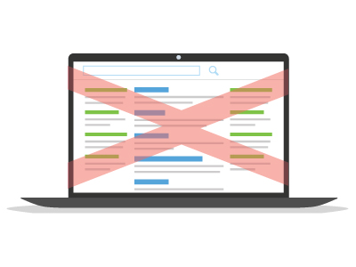
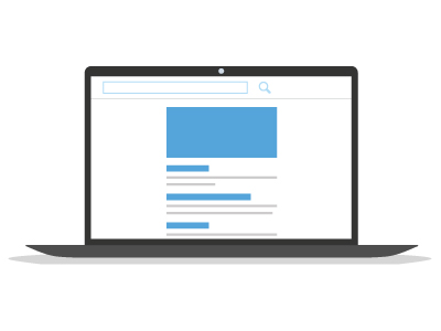
Single Column Design
[vc_row]
[vc_column width=”1/2″][vc_column_text]  [/vc_column_text][/vc_column]
[vc_column width=”1/2″][vc_column_text] [/vc_column_text][/vc_column]
[/vc_row]
By laying out all of the website’s content and flow into one single, easy to follow column, you can provide your users a faster pathway to purchase.
Attention spans are shorter than ever, and if a website starts to lose the focus of its users, you have effectively lost the opportunity to complete the sale. The number one factor to losing sales on your website comes from a lacking user experience architecture. When designing your website’s UX, it’s important to keep in mind the user’s proclivity for distraction. Focus your users’ attention on your content by lessening the distractions and introducing a single column design.
Streamline The Process
The shortest track from point A to point B will always be a straight line.
Now, imagine this in a web design. Having a users’ attention bounce from left to right and then down to the next row can be a long process that will effectively lose the users’ attention.
In a 1997 survey, we learned that the vast majority of people don’t actually read online – they skim! Check it: (http://www.nngroup.com/articles/how-users-read-on-the-web/). Single column website designs are built to be longer and slimmer, creating the optimal layout for skimming and easy information access.
In a world of insatiable digital metrics, eyeball tracking has been introduced in a number of fields allowing for a more direct analytics pattern. With a single column design, you can be assured of the best eye tracking metrics without the costly software and service
But where are the numbers to back up these proposed results?
In a MarketingExperiments webinar by MEClabs, the company shared their findings from a recent A/B Test they ran. Using a large tech company that creates and sells small business software, the folks over at MECLabs did some testing. The control design utilized a two column layout and the test used a single column. The content stayed the same on both websites. From this experiment, it was found that a single column layout had an increase of over 680%!
Long story short; a single column web design will focus your users attention, streamline the buying process, and is statistically proven to make more sales.
Any questions? Send an email and we’d be happy to chat!
[us_btn text=”Get a Quote” size=”large” align=”center” icon=”” target=”_blank” color=”green” link=”url:https%3A%2F%2Fpinksharkmarketing.com%2Fget-quote%2F”]


